Hello and happy Winter Wonderland weekend. I hope everyone on the east coast is thawed from the big blizzard that hit last week and has planned some fun activities now that it’s beautiful outside. For those of you who are working today, I’ll be joining you to ensure every game night tonight has some fantastic pizza. I spent the blizzard playing games with my friends instead of painting but I’m ok with that. Sometimes it’s good to remember that’s there’s a really fun game underneath all those figures. So let’s look at how one of those games are progressing.
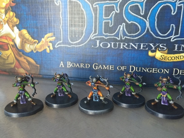
On these pieces I tried to focus on really nailing down my blending and getting bolder and brighter highlights. I’m feeling more skilled with the wet pallet now and I find myself mixing paint with a little more confidence. That isn’t to say these pieces are perfect. I’m still missing mold lines when cleaning and I rely on washes too heavily. Which makes getting bright colors that pop difficult.
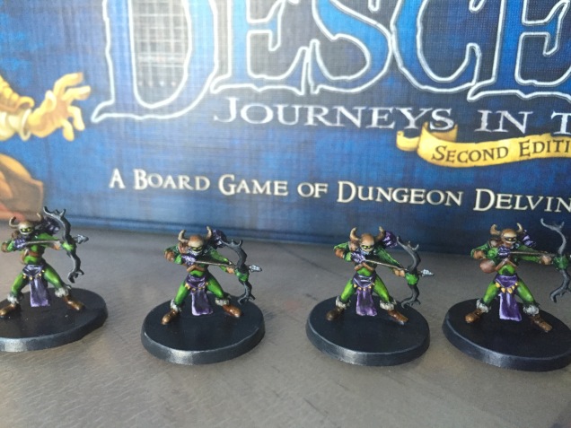
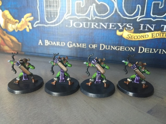
When painting I always use a color Wheel to help me plan how I want the mini to look beforehand. For these minis I chose to use Triad colors. Which for Green is Purple and for Red is Blue. You don’t have to live and die by the rules of your color wheel and you can experiment with tons of tones within a spectrum of color. But understanding color is essential to any visual art and when I started studying it there was a sudden jump in my miniature’s quality. To achieve the highlights on the clothing I simply added more and more white to my purple color mix.


After finishing the Boss Monster it was just down to the small details. I used some different shades of brown stripes to create straps and did a white highlight over dirty bone to make all the boots look furry at the top. Then everything was sprayed with crystal acrylic finish and after curing for a day a final Matt finishing spray to tone down the plastic shine look. Doing these sprays will alter your color a little (usually by darkening your colors a bit) but it’s worth it to get the protection needed when fingers will be rubbing the pieces for hours when playing. You can compensate by making the colors a shade brighter than you want them.

They look very good. I think you strike a good balance between high contrast highlights and shadows at the right places. The transitions seem also very smooth. To enhance them further I would suggest to add a sculpted base.
LikeLike
Thanks! I told myself I wasn’t going to rebase the monsters, just the heroes. But I think your right, it would bring everything up to the next level.
LikeLike
If you use a texture stamp you can produce some very nice dungeon floor in no time at all. Only catch could be that some of the decent scenarios play outside.
LikeLike
True but I think picking one scenery is still worth it. It would look more finished overall. I haven’t used those stamps before but it sounds like a nice compromise between time and quality. Thanks for the tip, I’ll have to do some research!
LikeLike